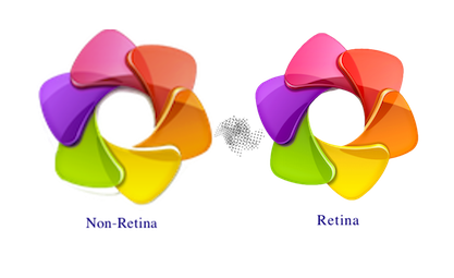
I finally went through and updated my entire site to Retina-ready images. It was a bit of a bigger effort than I had thought (even though there aren’t many resources that needed to be upgraded).
Why?
The decision to make my website Retina-ready came from me browsing other sites over the past little while and realizing how much better websites that were Retina-optimized looked on my laptop. It had a massive impact on my opinion of the company/person who owned the website. For example, a software company was much more likely to get my purchase if they had a Retina based website. When going back to check in on my site (a whole re-write is in progress as well, hopefully launching within the next month or two)– I had noticed that my website looked dreadful on Retina displays (and decent on non-retina displays).
How?
I decided to re-write my pages to use divs for images instead of
Where am I taking this?
I plan to make all future websites, and updates to this site– Retina ready. It really makes me look better as a developer, and allows me to be happy when looking at my own site. I also plan to bring these changes over to some freelance websites I’ve done, including Innisfil Dental’s website.
What? Retina?! What the heck is that? And why do you need to optimize?
A “Retina” screen is a screen where the human eye cannot discern pixels at a normal viewing distance. Retina displays run at double the resolution, or 4 pixels per CSS pixel. This means that if a website is serving a 300×300 picture, a Retina display is actually rendering that image at 600×600, scaling up. This would result in a seemingly blurry picture on these ones since WebKit needs to guess the additional pixels it’s missing. Websites should detect the screen pixel multiplier, and serve the appropriate image (300×300 to non-Retina screens, and 600×600 to Retina screens).
I am still experimenting with this, but please contact me if you have any input.
